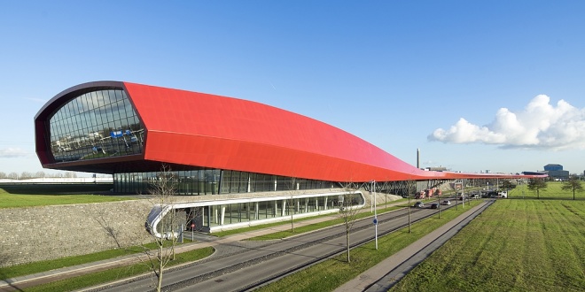
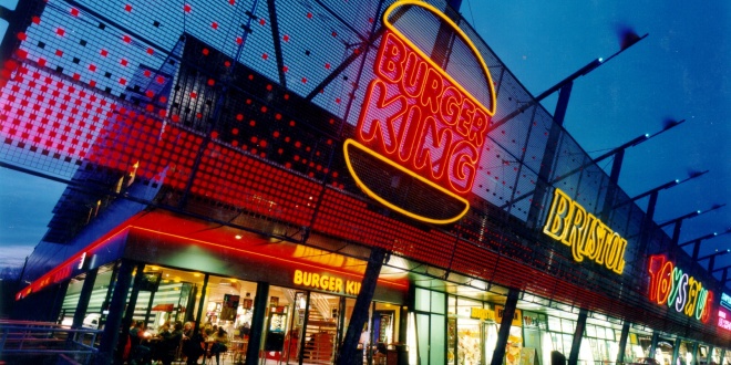
Next to the highway A2 near the centre of Utrecht a spectacular large scale shopping and leisure centre has been realised. The 800 meter long “Ferrari red” complex acts as a noise barrier to the new residential area of Leidsche Rijn. The fluent design of slowly undulating lines is inspired by the perspective of the driver passing the complex in 32 seconds, driving at a speed of 100 km/hour. The fluent lines create an illusion of movement. This building, having a surface area of approx. 65,000m2, houses many retail businesses, a high-quality DIY store, a catering business (fast-food restaurant) and leisure facilities (discotheque, sports or multi-purpose hall). On the roof is a 1400 spaces large car park. The building together with the ‘Cockpitgebouw’ at the Wetering Noord area, designed by the architect Kas Oosterhuis, are the showpiece of the city of Utrecht.
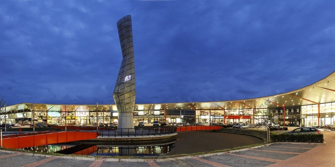
Cruquius Plaza, near Hoofddorp, municipality of Haarlemmermeer is the result of a competition that was organized in 1999 on behalf of the municipality of Haarlemmermeer to boost shopping in Cruquius. The competition was won by ING Vastgoed and VVKH. The existing residential boulevard has been completely renovated and adapted to the requirements of today. In addition, 30,000 m2 of retail space and 25,000 m2 of industrial space have been added. A flexible building, particularly with regard to the shops, and a water feature with a square at the shop entrances have been realized at the location. The cantilevered awning offers provides shelter for a pleasant shopping climate. The supply takes place from two expedition entrances on the company side. Via the internally located expedition corridors on the ground floor and first floor, the shops can be supplied freely from the shoppers. The 30-meter-high Cruquius Tower, the luminous center of the square, is a clear landmark of the residential boulevard.
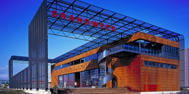
Just south of Berkel & Rodenrijs a new fire station has been built to service the suburbs build between Rotterdam and The Hague. Because of the growing number of inhabitants in this region, a future extension is already taken into account in the design. The total plot is covered with a steel mesh in which all future extensions will fit. The façade is covered with corten steel plating wich create the desired sturdy look.
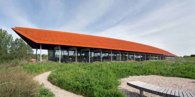
House Hilde lies on the dunes, on the tourist route between Station Castricum and dunes. The building opened in January 2015 and combines a depot with a museum function. The archaeological center is named Hilde, a woman from the fourth century AD and found in 1995 during an excavation in Castricum.
Hilde house was commissioned by the Province of North-Holland. Every Dutch province is responsible for the preservation and exhibition of archaeological finds within its borders. The old depot of North Holland in Wormer was too small, the climate was bad manageable and it was only limited accessible to visitors. The building on the Zanderij in Castricum offers plenty of space for storage and exhibiting archaeological finds and collections.
Hilde house has a floor area of 4,480 m2 and is divided into a pavilion and an underground depot. The building is designed with the surrounding landscape. The draft refers to an old dune landscape (so called “nollen” landscape) that is much older than the current shifting sand dunes and can still be found at various places in North-Holland. In the aboveground elongated pavilion on the one side the main entrance, with desk, museum shop, and a space for temporary exhibitions, cloakroom and toilets are situated, on the other side the office staff. On the first floor is a small restaurant with terrace and auditorium. The elongated shape and the 70-meter roof of the building refer to the early medieval farms, as they have been in the area. The curved roof structure is finished with Corten steel sheeting as a reference to thatched farms. The large overhangs of the roof protect the interior from direct sunlight, which allows the use of large glass surfaces. The façade is decorated with stone from Morocco, fossil pintail squid in it, a reference to the archaeological feature of the building. This stone also comes back into the interior.
The depot is about 2,200 m2 and is divided into several archives and the centrally located exhibition space. The hilly “nollen” landscape is, as it were, pulled over the depot. By placing a meter of sand on top of this part of the building a stable climate is achieved in a passive way and only limited installations are necessary in order to maintain a constant temperature and humidity in the depot. By putting strong in design and construction on sustainability House Hilde has an average score of 8.6 on the sustainability label. In addition, the integration of buildings with the landscape certainly has a symbolic value: in the ground is the best place to preserve archaeological treasures.
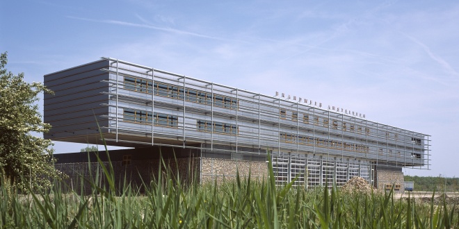
In 2003 a sturdy looking fire station was yielded. The building is located at the entrance of Amstelveen form highway A9 and shows the firetrucks ready for duty. The technical building on top of the rough base is used for offices, sleepingquarters and a gym. VVKH also designede the bridges crossing the water towards the building.
Alexandrium is made of 35.000m² megastores and 65.000m² home and living mall. The assignment was approved after winning the architectural competition and was build in two fases. Important aspect for winning te competition was the incorporation of the existing polderhuis, which seems to be placed in a window of the new mall.
Home and Living Mall Ekkersrijt is located on the north of Eindhoven, directly at the highway A50. In 2013 the existing shopping mall (21.000 sq.mtrs) has been extensively renovated and expanded with 24.000 sqr.mtrs.
New look and feel
The existing building was outdated and made up of separate buildings, with closed unattractive facades and entrances, shop windows only facing the courtyard. Experience and length of stay have been central themes to the renovation and expansion. The new complex has been given a contemporary, modern feel. Old, loose components and constructions are forged into a recognizable, homogeneous unit, which is easily visible from the public road. In addition, a pleasant living environment has been created for visitors. The original stores remained open during this major redevelopment. With intensive consultation and coordination between designer, consultants, tenants and builder the inconvenience during the construction has been limited to a minimum. With this transformation the center has been made future-proof.
Renovation
Existing shops have been given new facades to meet with the requirements of present times and to become one with the extension. Besides facades also the roof has been thoroughly upgraded and installations (among others sprinkler system) have been replaced, modernized. Signing is carefully incorporated and nowhere predominant.
Extension
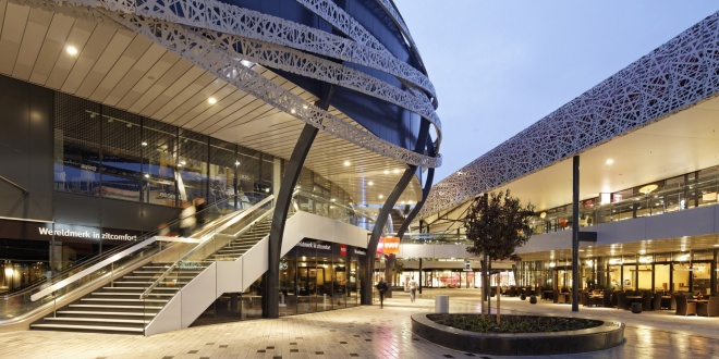
The new building has a distinctive façade of metal with a specifically, laser cut pattern. Recessed into the façade are the neon signs and the ramps to the parking deck. The movements of the cars on the ramps provides extra dynamism in a natural way.
On the former courtyard a freestanding oval new shop building is made. This building forms the heart of the new home and living mall and is, due to its special design, an icon to the highway and nearby. From the parking deck visitors reach the heart through walkways and they go with elevators and escalators to the open and indoor malls on the lower levels of the complex. Shops on the upper floors thereby have the same run as on the ground floor. Because of the oval building shopping at ground level has a pleasant scale with shops on both sides.
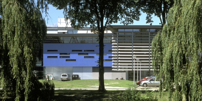
The new faculty OCP of Delft university of technology, accommodates the disciplines of Mechanical, Maritime and Industrial Design. During the constructionworks school continued. The new building shows a contemporary, logical and efficient architectural structure with it's own recognizable facade in the TU-district. The interior design is executed as an integral part of the whole plan.
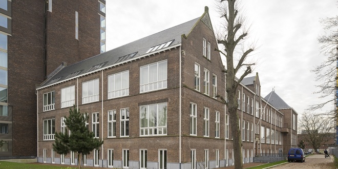
On the Boerhaave Campus, part of the Bio Science park in Leiden, the historical anatomy-building has been transformed into housing for Phd-students and researchers of the Leiden University. The new apartments are characterized by their high ceilings and old constructions. A small mezzanine is created to function as a bedroom. Right beside the existing building a new appartmentbuilding is erected, designed by Van Gameren of Mecanoo Architects. The total complex contains 166 apartments and is the first step in the complete transformation of the Boerhaave Campus.


