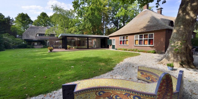
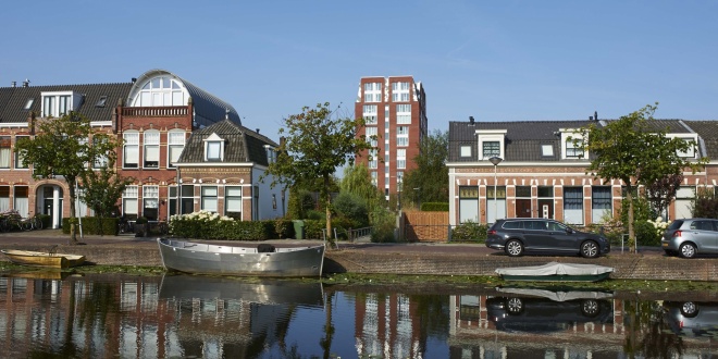
The house from the beginning of the 20th century was originally the staff residence of the adjacent main house “Malgre tout”. The main house and staff house are seen as examples of the development of country estates in the municipality. As an ensemble, the buildings and the surrounding gardens are of great cultural-historical value. The ensemble has the status of a national monument. The carefully detailed house is built in red brick under a thatched wolf roof. The staff house originally included a garage, horsestables and a driver's house.
In 2018, a design was made for the restoration and modernization of the service residence including a modern extension. A large living room and kitchen will be realized in the extension. A veranda will be added to the extension. Living room and veranda offer a view of a beautiful Hortensia garden. The extension is completely transparent on the side of the garden. On the other side, the extension is embraced by an openwork masonry wall. The wall becomes more transparent towards the edges. By using a heat pump installation with a source, high-quality insulation, and by completely filling the roof of the extension with solar panels, the service house will soon be completely energy neutral.
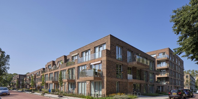
In Wassenaar, 40 duplex houses owned by the housing association St. Willibrordus have been replaced by 86 social rental dwellings, primarily intended for starters and seniors.
The site of the new social housing lies within a village extension from the 1960s. At the time, this was the northernmost district of Wassenaar — spaciously laid out, with views over meadows and farmhouses. In designing the plan for the replacement housing, we built upon the core qualities of the existing neighborhood: generous street profiles, front gardens, and abundant greenery.
The new social housing is distributed across six buildings arranged around a shared courtyard garden. By removing the Stompwijckstraat that previously ran between the plots, space has been created to accommodate residents’ parking within the block, while also allowing room for the communal garden. Along this garden, a community facility has been incorporated.
The buildings feature a formal frontage with so-called ‘zoom dwellings’ on the ground floor — shallow homes with their entrance and a small front garden facing the street. The rear sides adjoin the parking area, which is located beneath an open, green deck. The existing tree structure of the area has been preserved. To ensure privacy for the front gardens, a green strip separates them from the sidewalk. The upper-level homes are accessed via wide external galleries.
The urban design was created by Studio VVKH. To ensure the buildings align in scale with the surrounding structures along the long streets, the façade of the top (third) floor is set back slightly from the building line. The balconies create a connection with the street and are subtly angled to optimize orientation toward the sun. On the northern park side, the buildings are more robust in character, with their height responding to the adjacent apartment block.
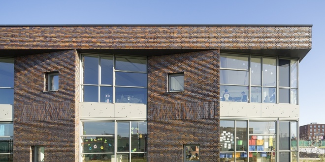
VVKH has been selected to design a primairy school at the Jazzsingel in Utrecht. The tough looking school is centrally located with a park as it's backyard. The classrooms are organised around an elips-shaped playroom for exercize, music and dance classes. The set backs in the side-facades allow each classroom a view to the park.
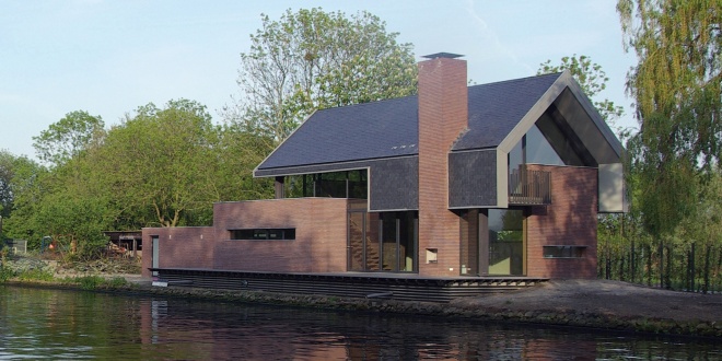
On a triangular plot, where the historical Vlietweg diverts from canal the Vliet, VVKH designed a house based on experiencing the Vliet. Rough, brick walls engage each other, vaging what is inside and outside. Water and landscape are part of the house.
At the entrance you're being received in a yard with monumental trees. The aperture in the wall give a first glance of the Vliet. From the high entrance it's three steps up to enter the livingroom giving a panoramic view over the Vliet, but shielded from the road.The folding window opens completely and extents the livingroom straight to the edge of the water. A stair with cantilevered steps and a glass balustrade leads to the first floor.
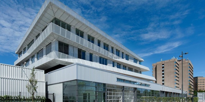
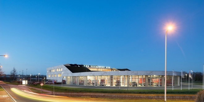
A former Mercedes showroom is rebuild to become the regional ambulance station. From here thirteen ambulances are ready to tear out in an emergency. On top of the existing showroom an new building with offices and a hightech trainingcenter is oriented at the a busy railwayline. The new part is a sturdy building with overhanging balconies which provides shade in summer and window cleaning. In the front facade, at the Vondellaan, a small ambulance museum is created.
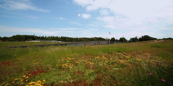
On the east side of Enschedé, on the outskirts of the city center lies the Miro shopping centre. The former mall has gradually been replaced by new buildings and was worn out. The new building has a curved façade and a large canopy. It embraces the public space and the high-quality parking facility. The shopping facade ends on the east side in a shopping arcade, which contains a large supermarket. On the west side the arcade accumulates into a two storey development. Together with public buildings on the other side of the road the building forms a port that marks the transition from the green suburban neighbourhood to the city itself. The complex includes a green roof that connects on the east end to an ecological zone for butterflies and bats.
This new building had become a recognisable beacon on the edge of the city of Assen. The building accommodates several emergency services such as a firestation, the Area Health Authority and the Safety Region Drenthe. Together with the Koopmans Bouwgroep, VVKH won the design & build competition. The new building is compact, sturdy looking and radiates preparedness for an emergency. All functions have been placed under a single roof, organised around a central atrium. From the atrium there’s a view on the court yard where fireman are practicing. The firetrucks are stationed around the court yard, ready to tear out. Offices are concentrated on the higher floors overlooking the highway A28. The building has a very high sustainability-rating (Dutch GPR-score 8,0).
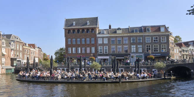
In the old wharf cellars at the intersection of the Oude and Nieuwe Rijn in the center of Leiden is the café restaurant "Annie's". We designed a curved floating terrace on behalf of the owner of the restaurant.
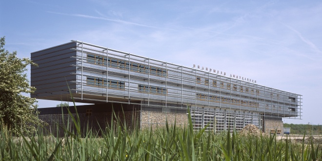
In 2003 a sturdy looking fire station was yielded. The building is located at the entrance of Amstelveen form highway A9 and shows the firetrucks ready for duty. The technical building on top of the rough base is used for offices, sleepingquarters and a gym. VVKH also designede the bridges crossing the water towards the building.
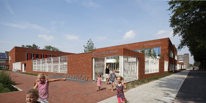
At the Duurstedelaan in Utrecht lies one of the most sustainable schools of the Netherlands. The school is centrally located in a reviving neighbourhood, in the south of Utrecht and accommodates three primary schools, a nursery and a broad programme of functions related to the school and local community. Future users participated from the start in the design-process. Different users gain with collaboration, but also want to be recognized and have their own specific needs. All functions are organised round a collective court space. The gym is constructed above this space and thus forms the roof of the court. The building is set up in red brickwork that is continued in the playground boundaries. The identity of the different schools is reflected in their own colour and pattern in het façade panelling and silhouette of the building-mass. The whole setup matches with the urban scale of the neighbourhood and blends in naturally.
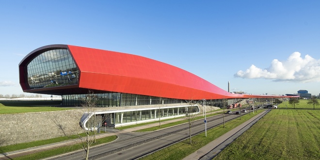
Next to the highway A2 near the centre of Utrecht a spectacular large scale shopping and leisure centre has been realised. The 800 meter long “Ferrari red” complex acts as a noise barrier to the new residential area of Leidsche Rijn. The fluent design of slowly undulating lines is inspired by the perspective of the driver passing the complex in 32 seconds, driving at a speed of 100 km/hour. The fluent lines create an illusion of movement. This building, having a surface area of approx. 65,000m2, houses many retail businesses, a high-quality DIY store, a catering business (fast-food restaurant) and leisure facilities (discotheque, sports or multi-purpose hall). On the roof is a 1400 spaces large car park. The building together with the ‘Cockpitgebouw’ at the Wetering Noord area, designed by the architect Kas Oosterhuis, are the showpiece of the city of Utrecht.
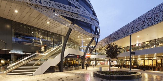
Home and Living Mall Ekkersrijt is located on the north of Eindhoven, directly at the highway A50. In 2013 the existing shopping mall (21.000 sq.mtrs) has been extensively renovated and expanded with 24.000 sqr.mtrs.
New look and feel
The existing building was outdated and made up of separate buildings, with closed unattractive facades and entrances, shop windows only facing the courtyard. Experience and length of stay have been central themes to the renovation and expansion. The new complex has been given a contemporary, modern feel. Old, loose components and constructions are forged into a recognizable, homogeneous unit, which is easily visible from the public road. In addition, a pleasant living environment has been created for visitors. The original stores remained open during this major redevelopment. With intensive consultation and coordination between designer, consultants, tenants and builder the inconvenience during the construction has been limited to a minimum. With this transformation the center has been made future-proof.
Renovation
Existing shops have been given new facades to meet with the requirements of present times and to become one with the extension. Besides facades also the roof has been thoroughly upgraded and installations (among others sprinkler system) have been replaced, modernized. Signing is carefully incorporated and nowhere predominant.
Extension
The new building has a distinctive façade of metal with a specifically, laser cut pattern. Recessed into the façade are the neon signs and the ramps to the parking deck. The movements of the cars on the ramps provides extra dynamism in a natural way.
On the former courtyard a freestanding oval new shop building is made. This building forms the heart of the new home and living mall and is, due to its special design, an icon to the highway and nearby. From the parking deck visitors reach the heart through walkways and they go with elevators and escalators to the open and indoor malls on the lower levels of the complex. Shops on the upper floors thereby have the same run as on the ground floor. Because of the oval building shopping at ground level has a pleasant scale with shops on both sides.
On a piece of wasteland in Leiden between the Lucebert Street and Toussaintkade an apartment building, ‘the Verleyding’ will rise this year. Construction started in March. In the building are 112 rental apartments for young professionals between 18 and 35 years. The properties are suitable for 1- or 2-person households, and have a surface of approximately 30 m2 (one-room apartment) and 45 m2 (two-room apartment).
The project is being developed and built by ten Brinke respectively Real Estate and ten Brinke Bouw. After realization the building owner will be SHWJ, Leiden. The housing design is tailored to the needs of SHWJ.
The building is 12 floors high and will become a landmark in Leiden. The area is bounded by the railway, a pond and a small park. On the park side the building stands on columns. Under the underpass, the entrance and lift are located. Together with the corridor access therefore an efficient plan has been realized, with 10 dwellings per floor. The upper apartments have stunning views over the city. The view can fully be enjoyed through the large windows. The ground level apartments have their own garden. Residents can cross a bridge over water to the park. Parking takes place on private property. The main body is constructed in a rhythm of frameworks of orange brick. The large frameworks ensure that the building looks less massive and joins well in the neighbourhood. The roof shape refers to the adjacent housing, it is finished with aluminium losagnes.


