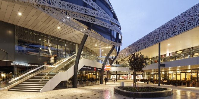
Home and Living Mall Ekkersrijt is located on the north of Eindhoven, directly at the highway A50. In 2013 the existing shopping mall (21.000 sq.mtrs) has been extensively renovated and expanded with 24.000 sqr.mtrs.
New look and feel
The existing building was outdated and made up of separate buildings, with closed unattractive facades and entrances, shop windows only facing the courtyard. Experience and length of stay have been central themes to the renovation and expansion. The new complex has been given a contemporary, modern feel. Old, loose components and constructions are forged into a recognizable, homogeneous unit, which is easily visible from the public road. In addition, a pleasant living environment has been created for visitors. The original stores remained open during this major redevelopment. With intensive consultation and coordination between designer, consultants, tenants and builder the inconvenience during the construction has been limited to a minimum. With this transformation the center has been made future-proof.
Renovation
Existing shops have been given new facades to meet with the requirements of present times and to become one with the extension. Besides facades also the roof has been thoroughly upgraded and installations (among others sprinkler system) have been replaced, modernized. Signing is carefully incorporated and nowhere predominant.
Extension
The new building has a distinctive façade of metal with a specifically, laser cut pattern. Recessed into the façade are the neon signs and the ramps to the parking deck. The movements of the cars on the ramps provides extra dynamism in a natural way.
On the former courtyard a freestanding oval new shop building is made. This building forms the heart of the new home and living mall and is, due to its special design, an icon to the highway and nearby. From the parking deck visitors reach the heart through walkways and they go with elevators and escalators to the open and indoor malls on the lower levels of the complex. Shops on the upper floors thereby have the same run as on the ground floor. Because of the oval building shopping at ground level has a pleasant scale with shops on both sides.
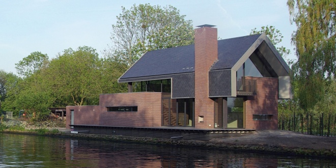
On a triangular plot, where the historical Vlietweg diverts from canal the Vliet, VVKH designed a house based on experiencing the Vliet. Rough, brick walls engage each other, vaging what is inside and outside. Water and landscape are part of the house.
At the entrance you're being received in a yard with monumental trees. The aperture in the wall give a first glance of the Vliet. From the high entrance it's three steps up to enter the livingroom giving a panoramic view over the Vliet, but shielded from the road.The folding window opens completely and extents the livingroom straight to the edge of the water. A stair with cantilevered steps and a glass balustrade leads to the first floor.
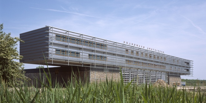
In 2003 a sturdy looking fire station was yielded. The building is located at the entrance of Amstelveen form highway A9 and shows the firetrucks ready for duty. The technical building on top of the rough base is used for offices, sleepingquarters and a gym. VVKH also designede the bridges crossing the water towards the building.
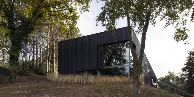
Villa Meijendel takes its name from the nature reserve in which it is located, where a forest meets a valley of dunes. The house is constructed from concrete and set into the side of a sandy slope. The building's design aims to create a dialogue with its surroundings, both through the way the form and materials engage with the landscape, and through the use of glass to provide views out from and into the house.
The boxy geometric structure is entirely clad in charred timber, creating a textured black surface that appears different depending on how sunlight falls on it. The exterior finish, inspired by the ancient Japanese shou sugi ban technique, also helps to preserve the wood. Sometimes the house is almost invisible against the dark edge of the forest, sometimes it sparkles in the sunlight because of the glittering charred wood, as such forming a background for the play of shadows of tree trunks and branches. The villa hides and reveals itself in the landscape.
The property has its entrance on a middle level accommodating an office and two bedrooms. Stairs ascend to an open-plan kitchen and living space, and drop down to a master bedroom and gym room.
The living room features a full-height corner window that looks out through the trees towards the dune valley. A lower window facing to the rear and a large glazed surface lining the adjacent double-height circulation area face out onto the forest. At the far end of the first floor, sliding glass doors lead out from the kitchen onto a terrace.
The material palette –concrete, steel and anodised aluminium– was chosen to complement the tones and textures of the surrounding environment. Each material is applied in a raw, untreated form. Internally, the walls are finished with smooth concrete, while the rough-sawn Douglas fir beams supporting the ceilings feature a distinctive grain.
West 8, Adriaan Geuze, is responsible for the garden design.
Photography is by Christian van der Kooy


